

KCTech
Red
Pantone 1795C
C5 M100 Y100 K0
R226 G30 B38
KCTech Corporate Identity
Visual Concept
The logotype expresses the vision and dynamic progress of KCTech based on its exceptional technology and the folded part of 'KC' symbolizes flexible change and new creativity.
Corporate Logo
Brand Logo
The brand logo implies KCTech’s figurative characteristics and symbols. It is used on all media representing KCTech to convey the brand image.

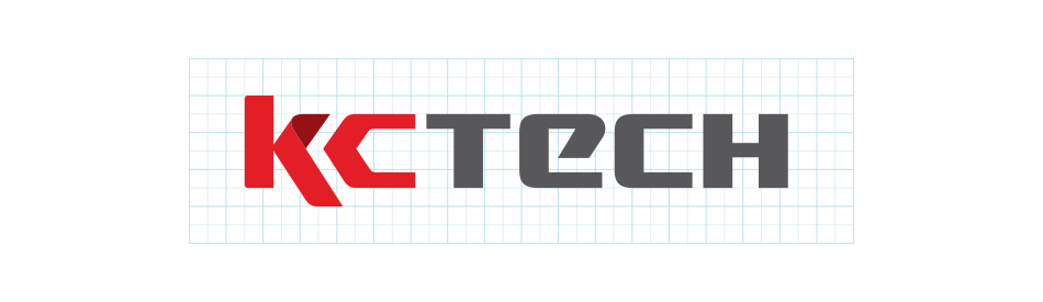
Grid System
Grid System
The grid system is the drafting standards provided to maintain the consistency of brand logo. If it is necessary to produce larger sizes or impossible to use computerized printing, the brand visuals must be drafted precisely using the grid.
Slogan Signature
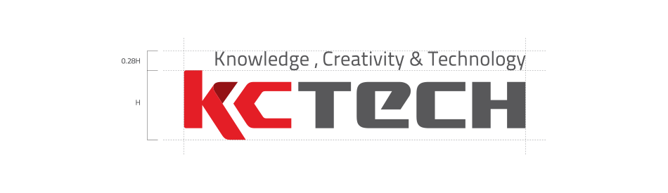
Slogan Combination
The slogan signature specifies how the brand logo should be combined with the slogan. It suggests the golden proportion of all elements for consistency and communication.
Korean Logotype
Logotype in Korean
The logotype in Korean uses Nanum Bareun Gothic Bold. You must not change the ratio and spacing and use the data in the manual for duplication.

Solid Color Type
Single-colored Logotype
The basic logo shall be used primarily, but the single-colored logotype may be used on backgrounds where some colors are illegible or in case of unavailability of colors.


Color System
Color Regulations
When applied to the printing media, the colors shall be based on CMYK and standardized based on the Pantone Colors or 4 Primary Process Colors in the Guide.
Main Color
KCTech
Red
Pantone 1795C
C5 M100 Y100 K0
R226 G30 B38
KCTech
Dark Gray
Pantone Cool Gray 11C
C0 M0 Y0 K80
R88 G88 B91
Sub Color
KCTech
Dark Red
Pantone 1815C
C15 M100 Y100 K35
R147 G18 B21
KCTech
Gray
Pantone Cool Gray 6C
C0 M0 Y0 K40
R167 G169 B171
KCTech
Light Gray
Pantone Cool Gray 2C
C0 M0 Y0 K20
R209 G210 B212
Metalic Color
Pantone 873C
C15 M20 Y60 K10
R198 G177 B113
Pantone 877C
C0 M0 Y0 K40
R167 G169 B171
Incorrect Usage
Prohibitions
Distorted use of original shape and colors of brand logo is prohibited as it may alter the brand image or interfere with consistency of communication. The example suggests the prohibitions of use and must strictly be followed:

The shape of brand logo has been distorted.

The ratio of brand logo has been altered.

The visuals have been combined randomly.

The brand logo has applied random colors.

The logotype is written using a different font type.

Gradation has been applied to the brand logo.
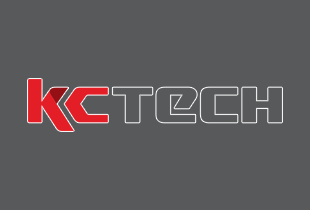
Borderlines have been applied to the brand logo.

Visibility has been reduced by inappropriate background colors.

Visibility has been reduced by a complex background.